Time
- 2015 – 2016
Role
- UX Design
- UI Design
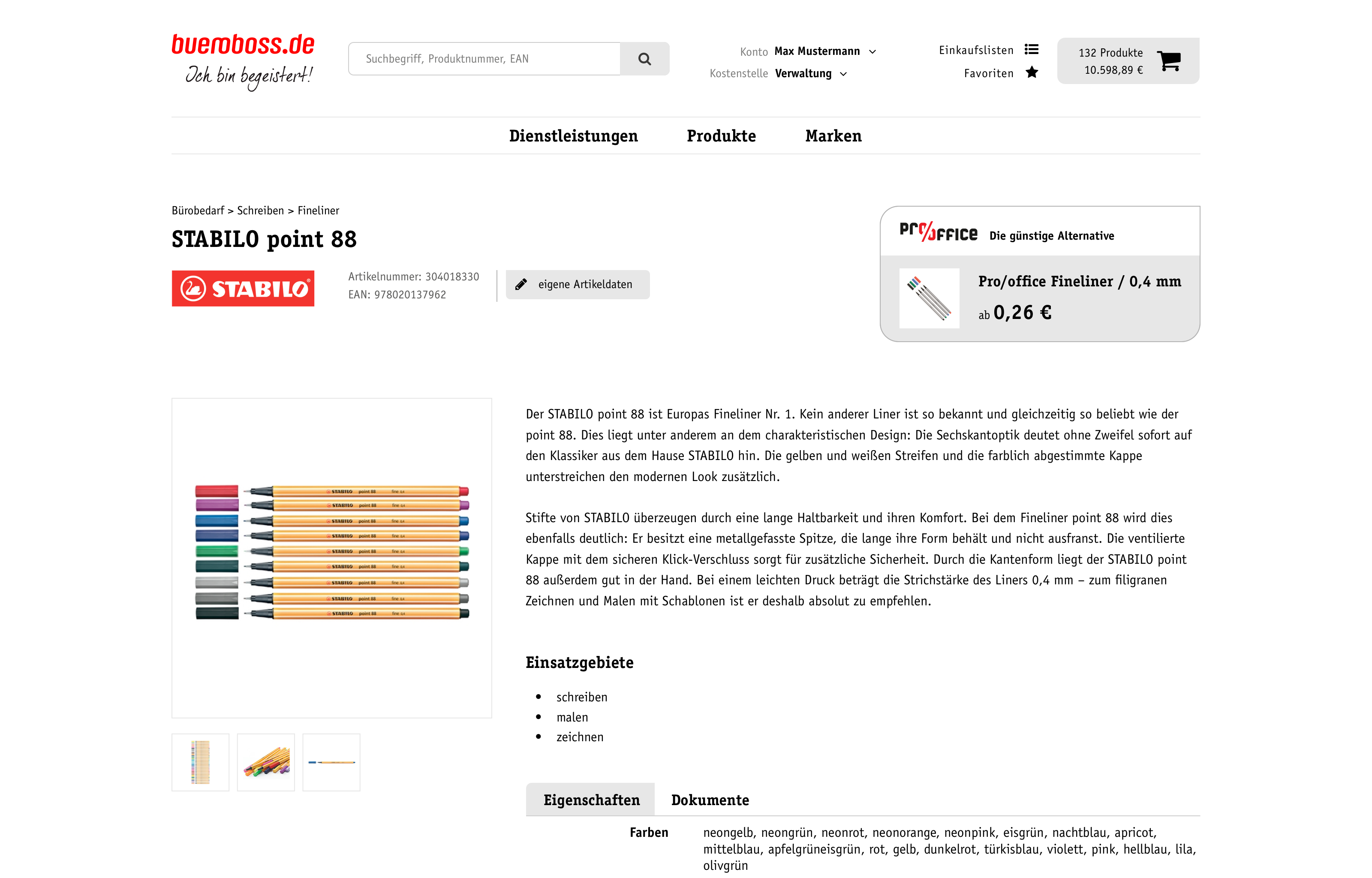
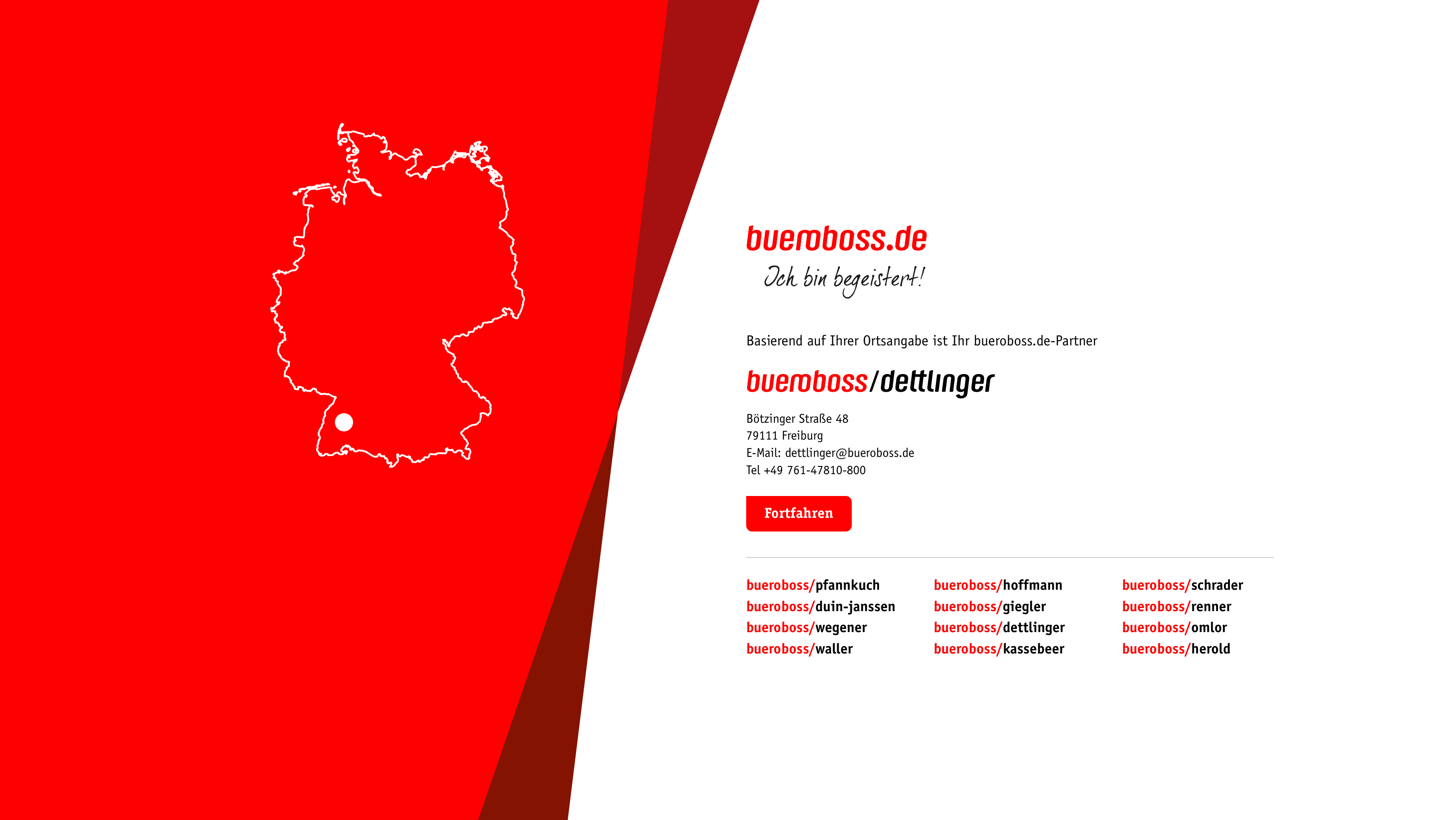
bueroboss.de is a union of office supply sellers with multiple local branches across Germany. For their new website and b2b online shop I was commissioned to work on the UX concept and create the interface design.
Some special requirements had to be met concerning the representation of the individual members of the union and most of all concerning e-commerce in a b2b environment.
Research, Planning and Conception
The project kicked off with a series of multi-day workshops with relevant stakeholders. bueroboss was a very well prepared client, contributing personas and an extensive list of roundabout 400 user stories and requirements for the redesign.
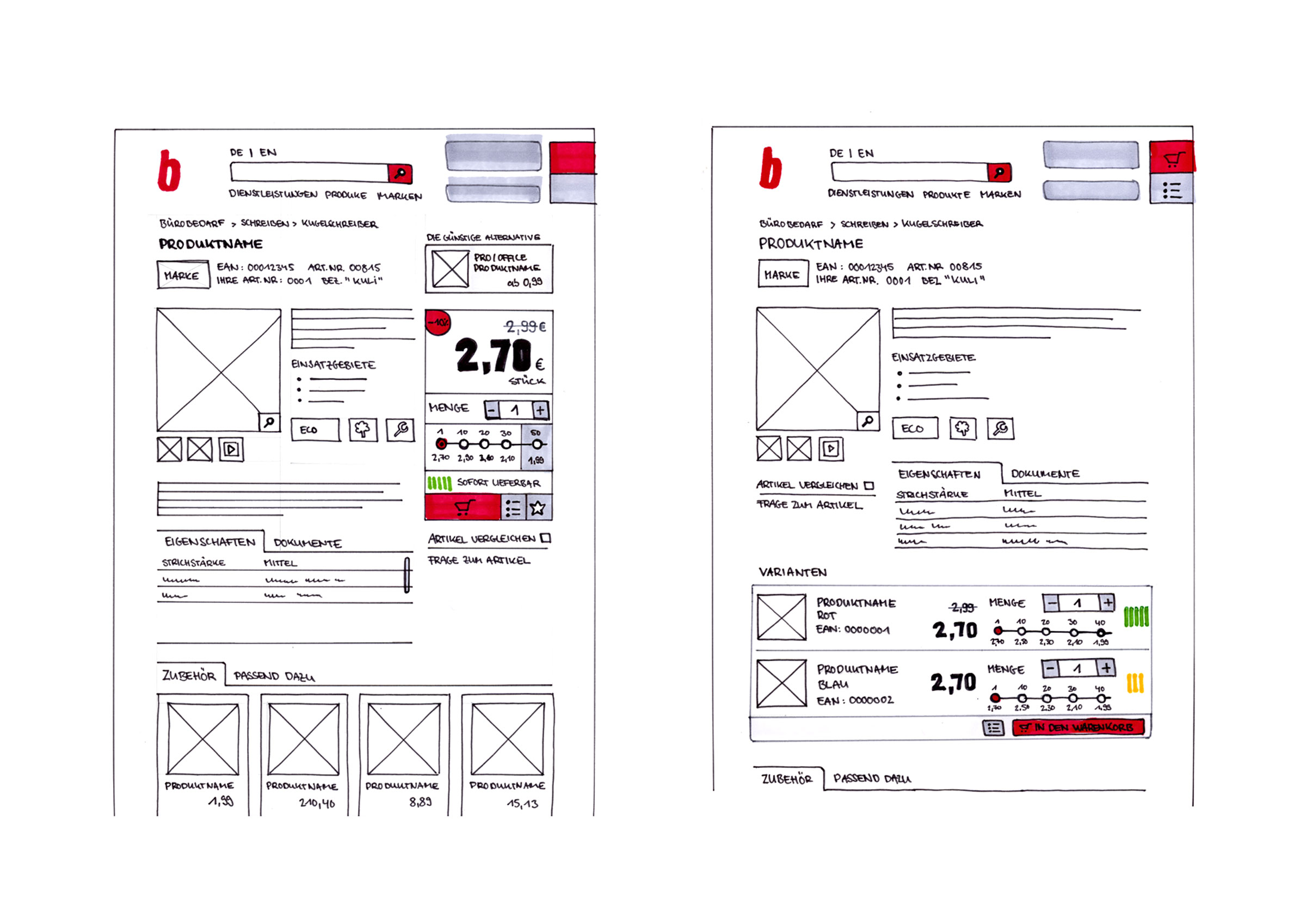
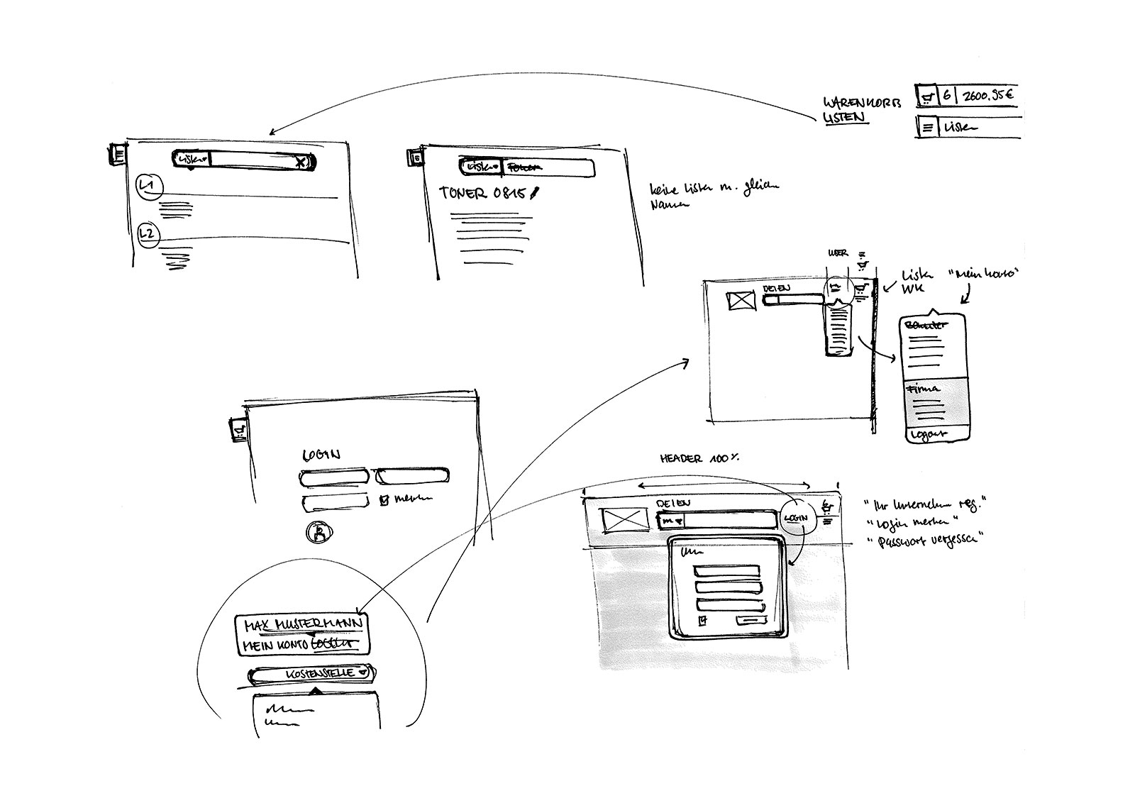
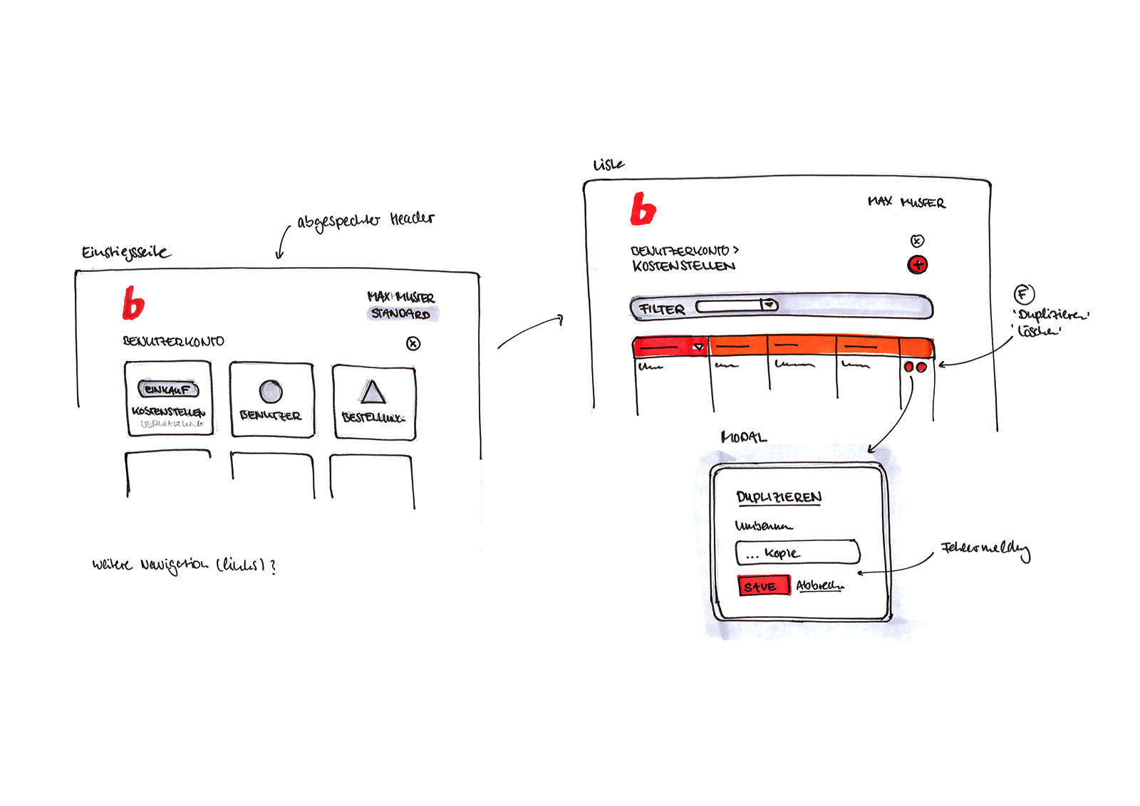
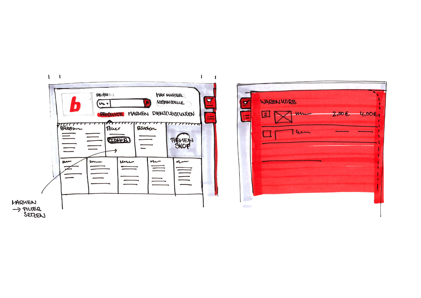
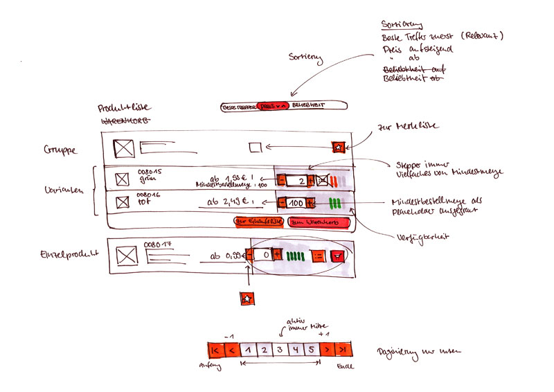
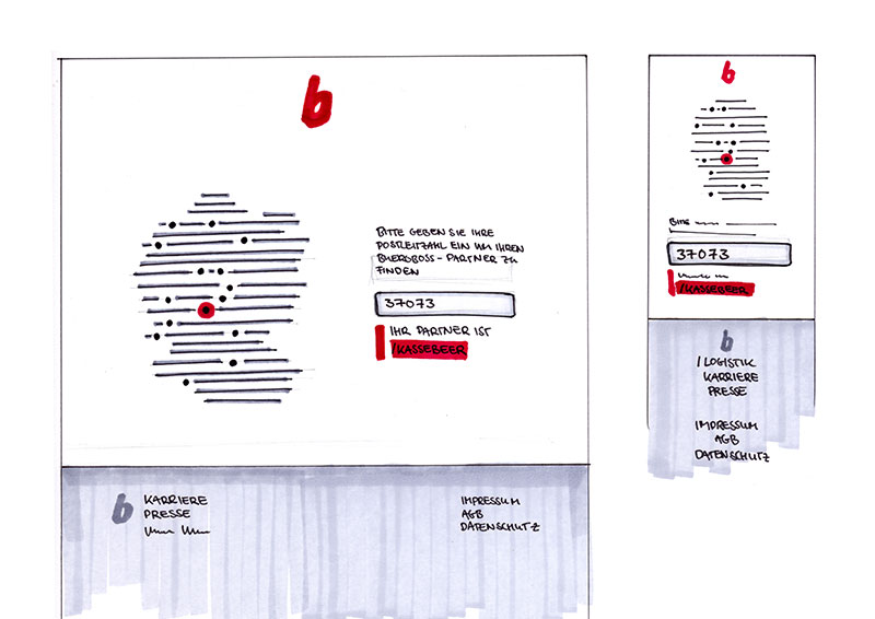
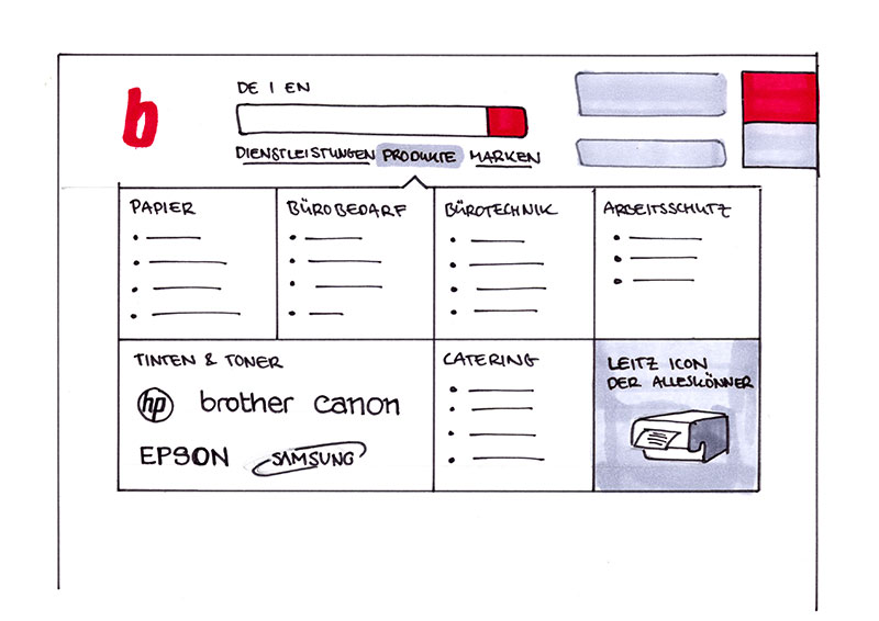
In order to enable a rapid process and gather early feedback the basics – and later the refinement – of the UX and UI design were done with pen and paper sketching. This proved to be a very collaborative and valid approach.
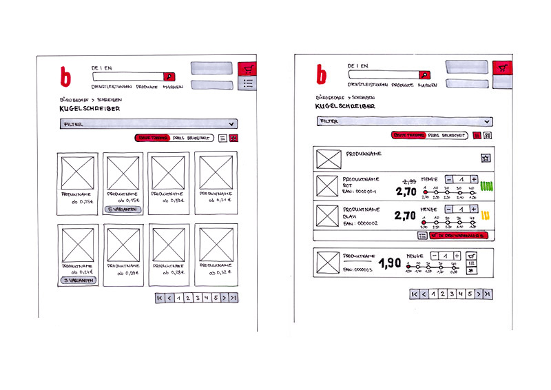
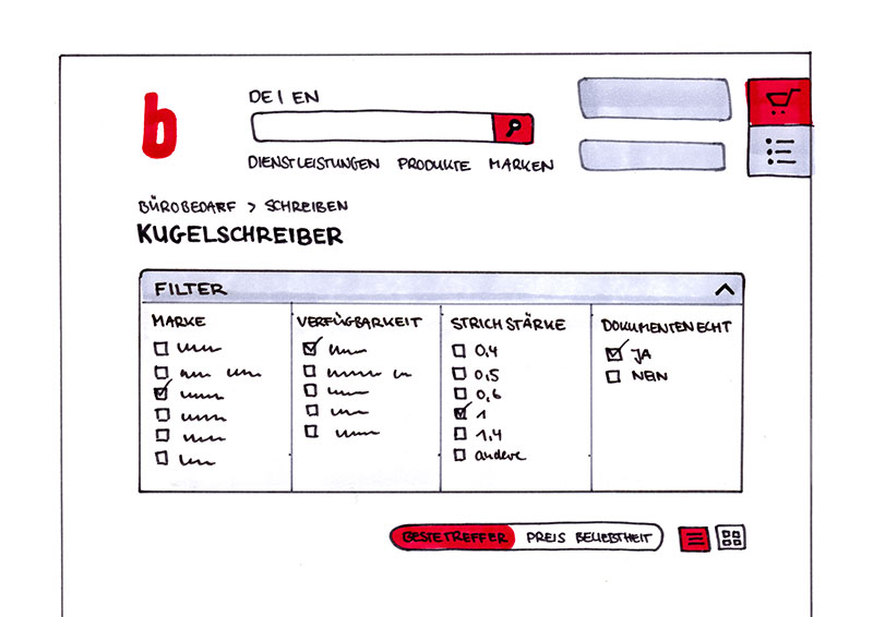
The user interface Design
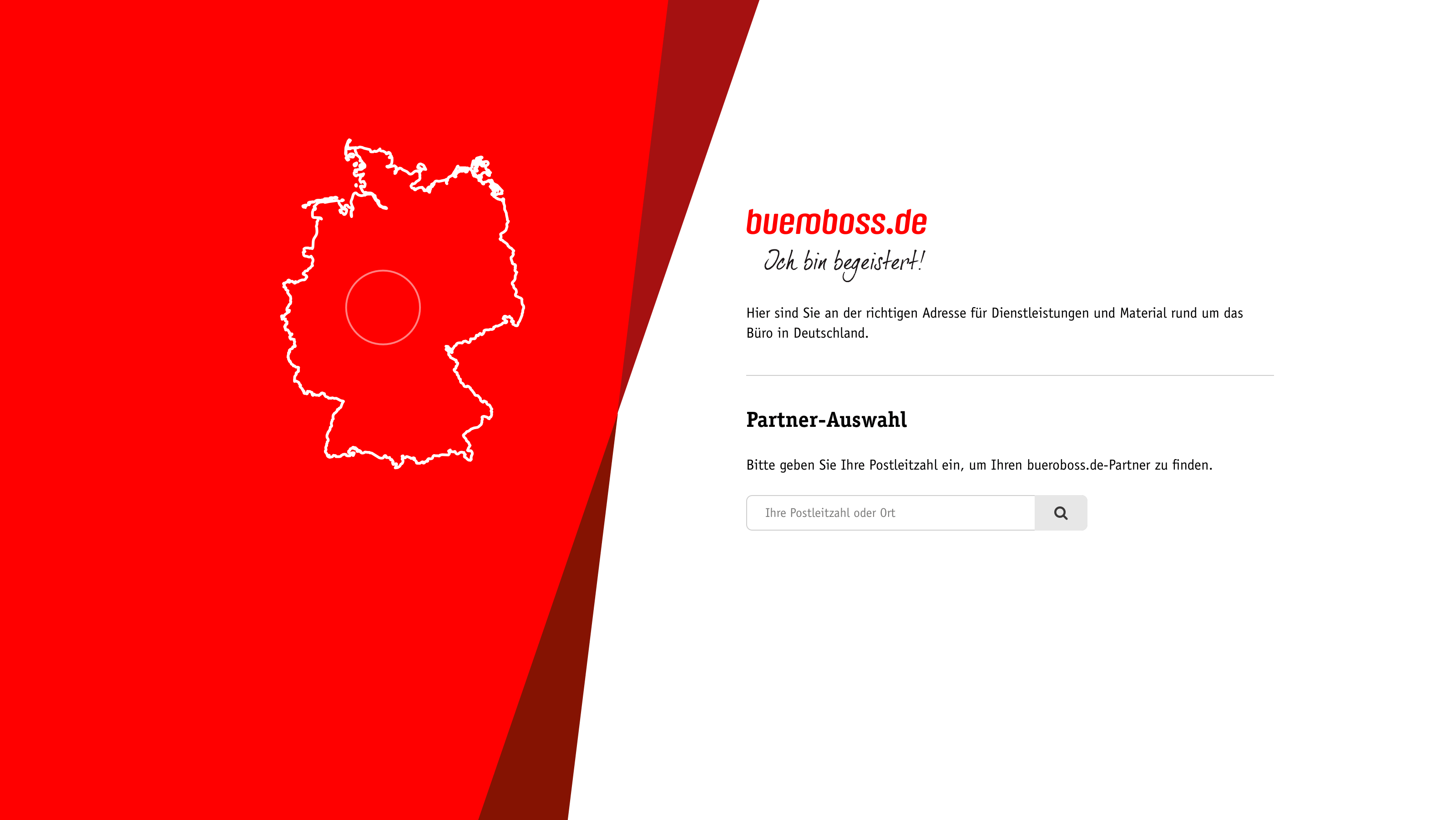
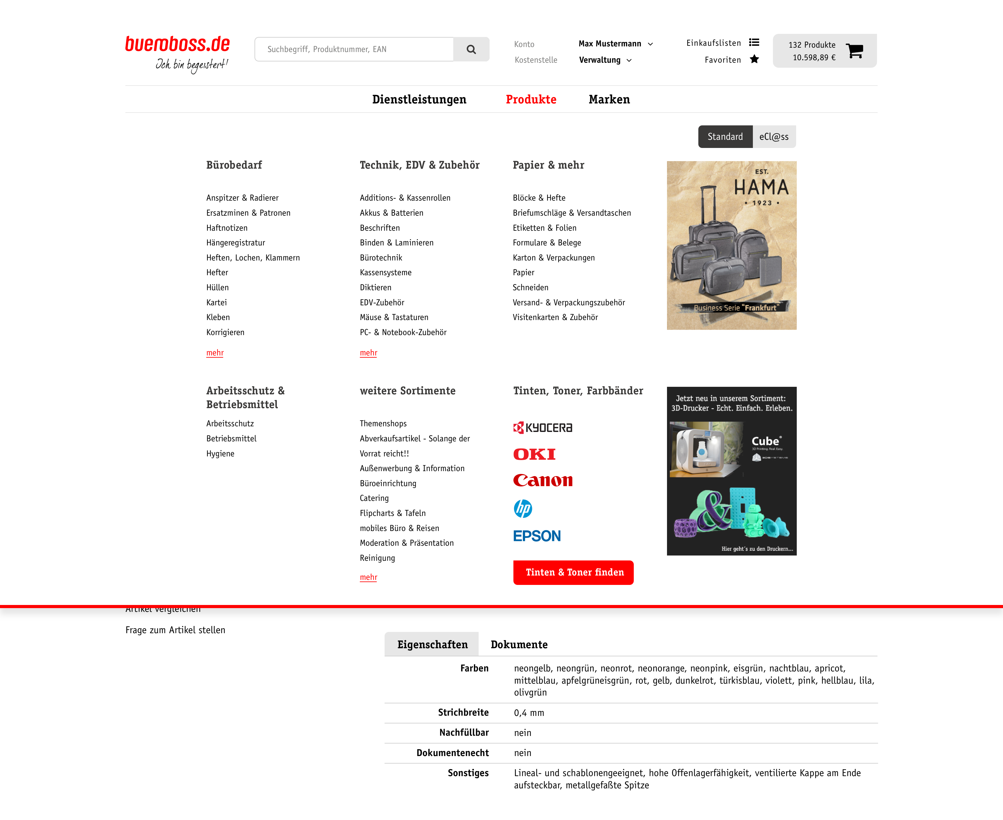
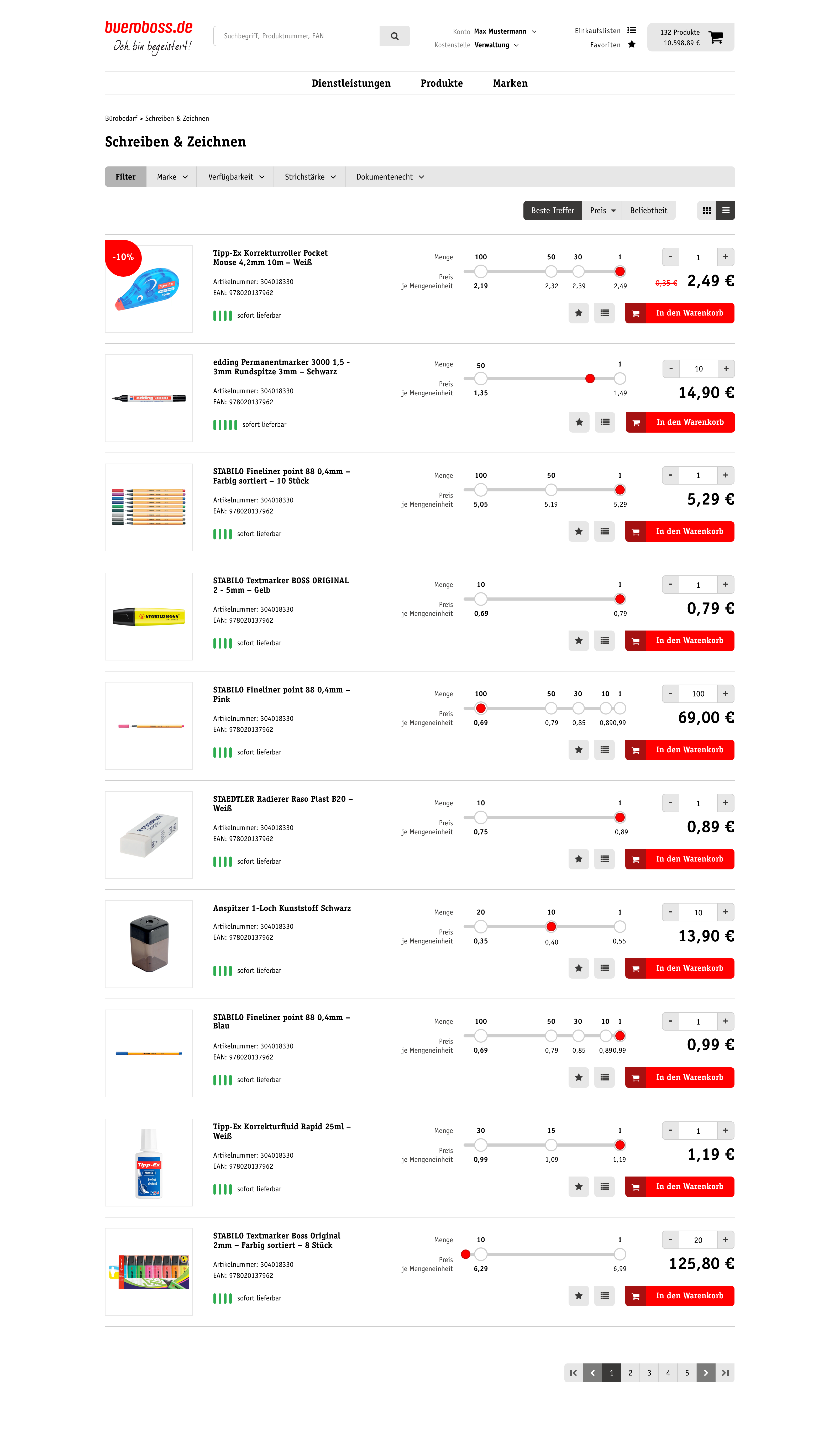
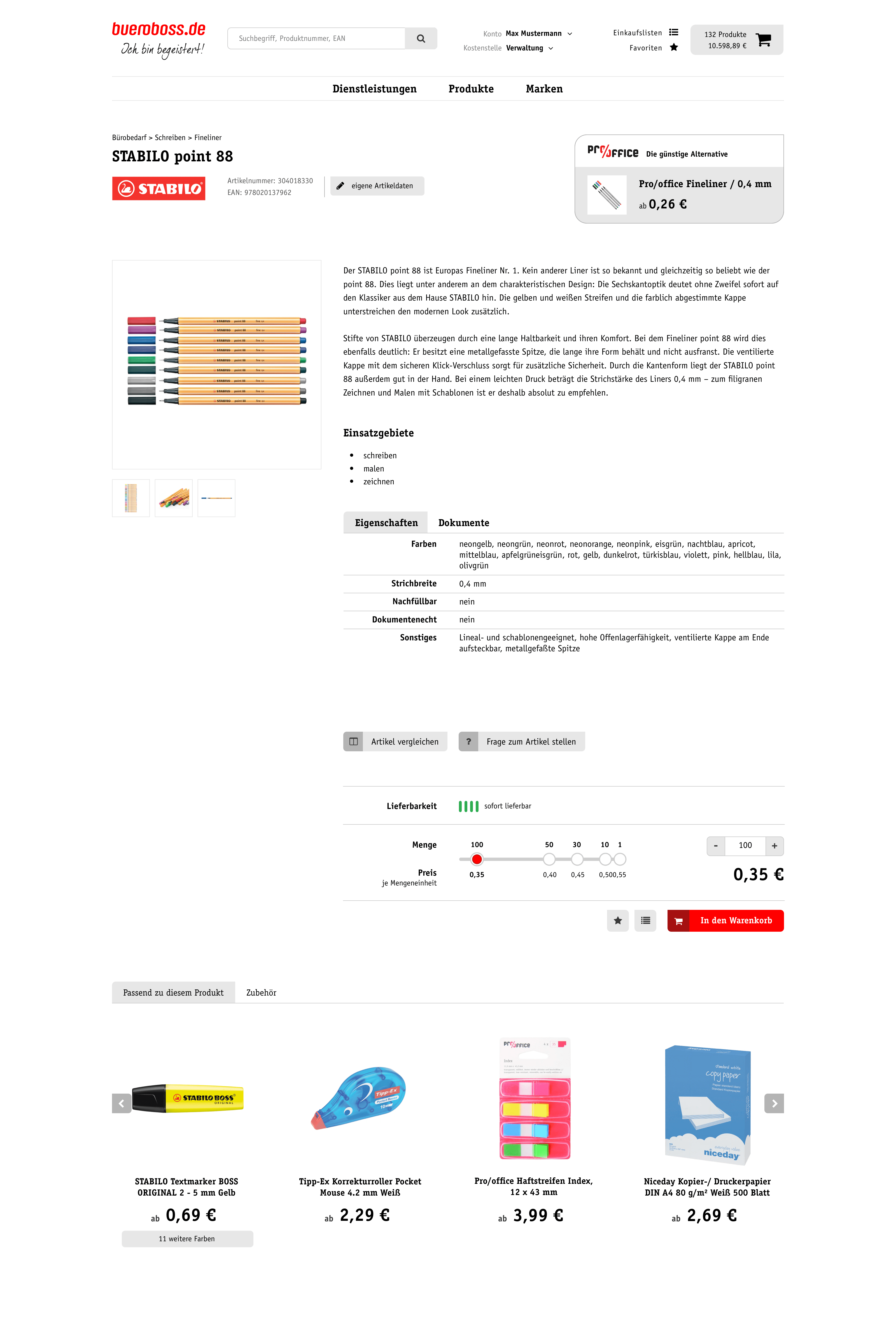
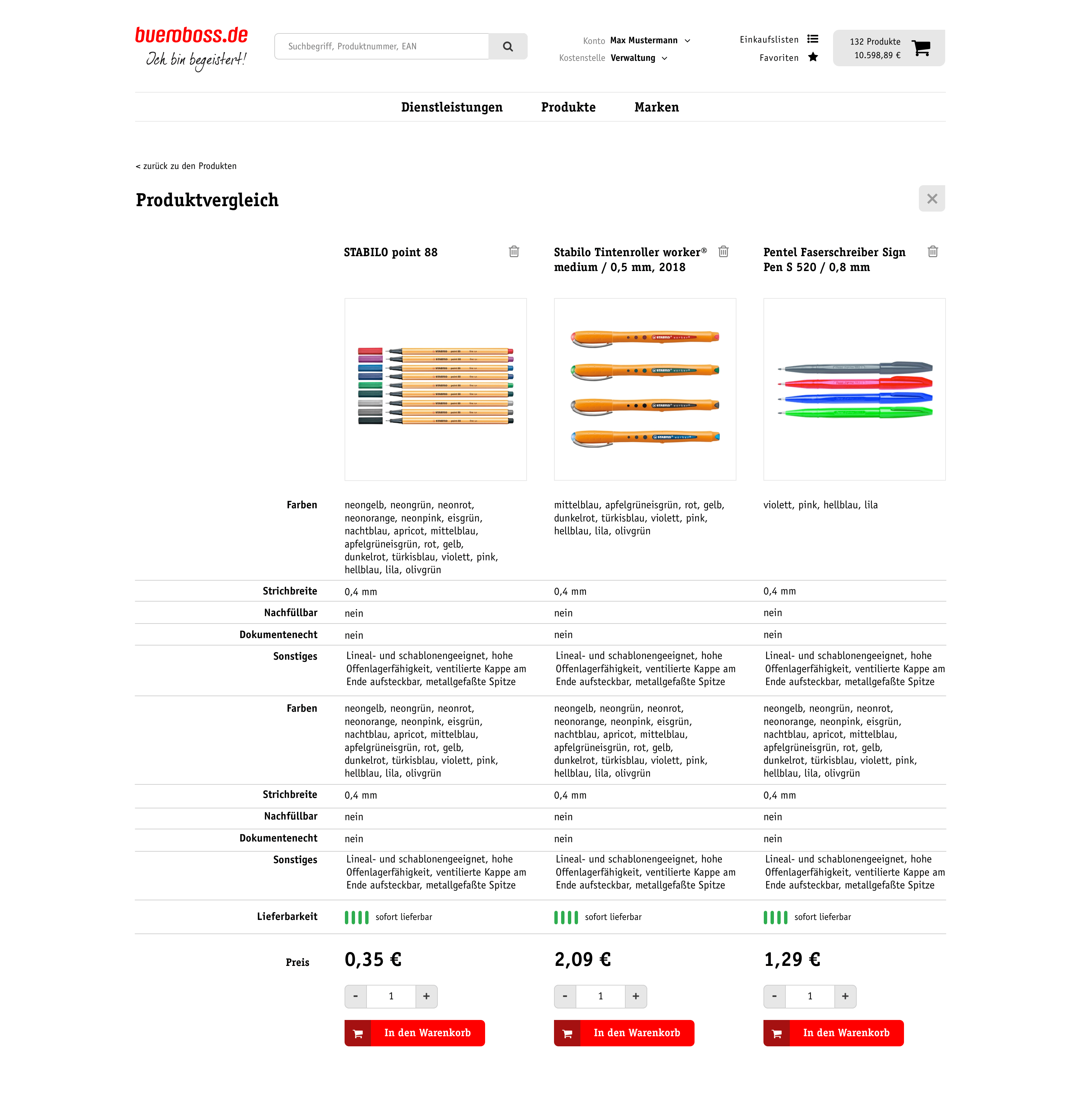
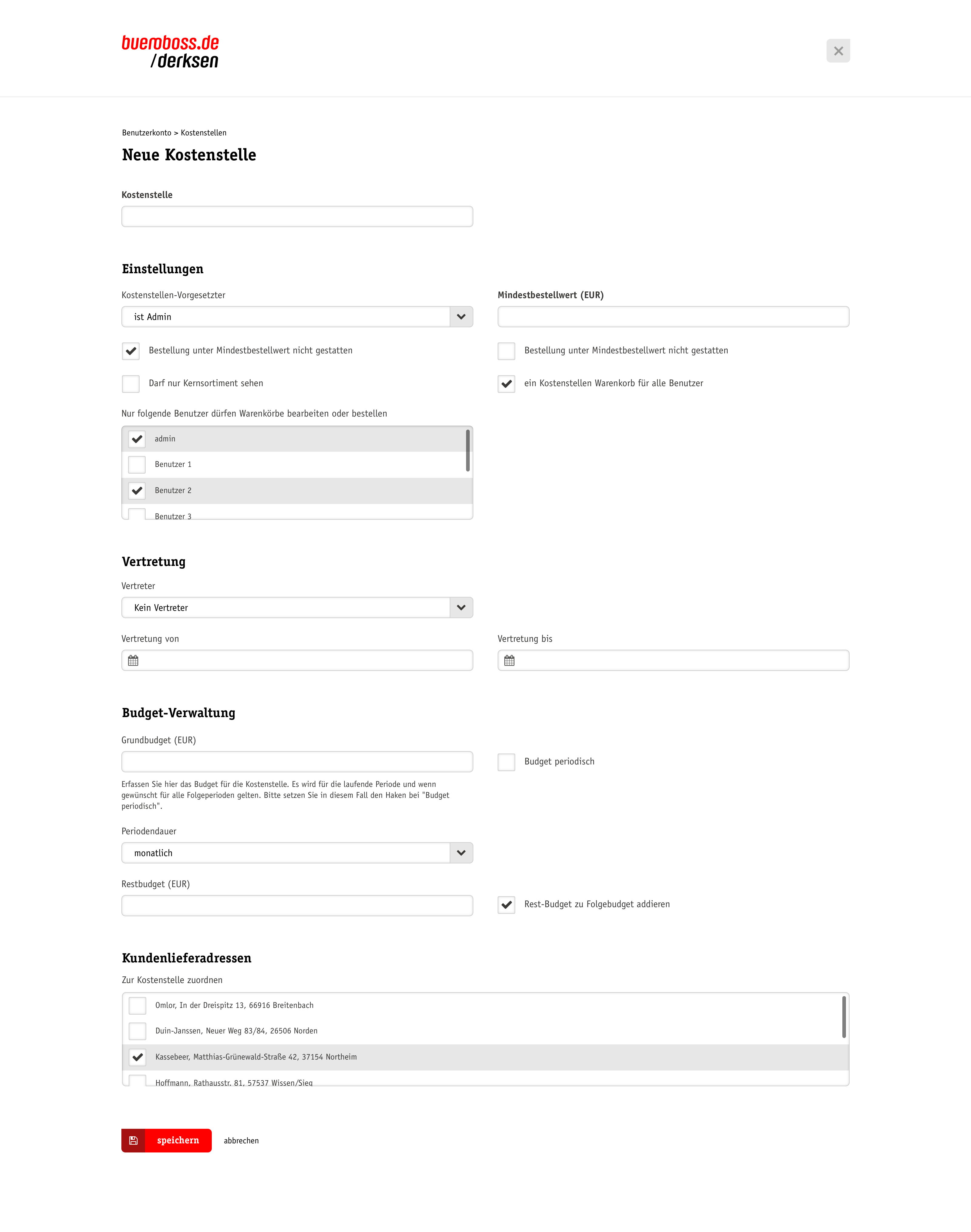
Due to the detailed planning, designing the interface was pretty straightforward. Visually the design of the web experience is adopting bueroboss's visual corporate identity developed by renowned design agency Heine Warnecke.
Responsiveness
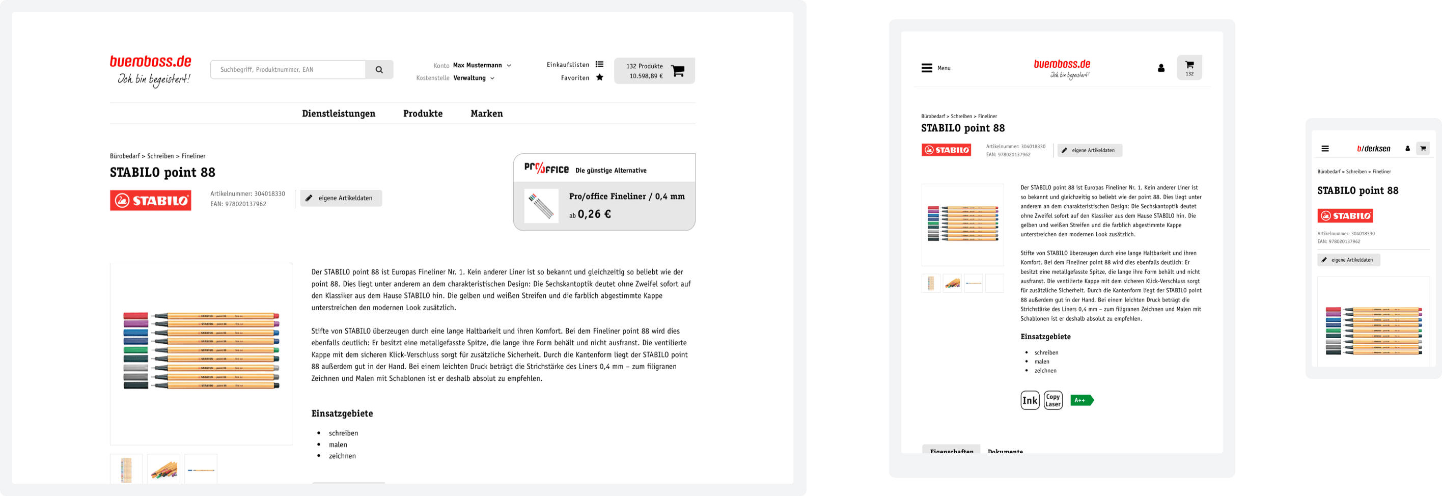
Surely the biggest improvement accomplished by the redesign was responsiveness for the website and the shop, making it accessible and usable from all kinds of devices.
All workflows, containers and components were designed in multiple resolutions for handoff to development to work seamlessly.
Making saving easy Improved UX for block pricing
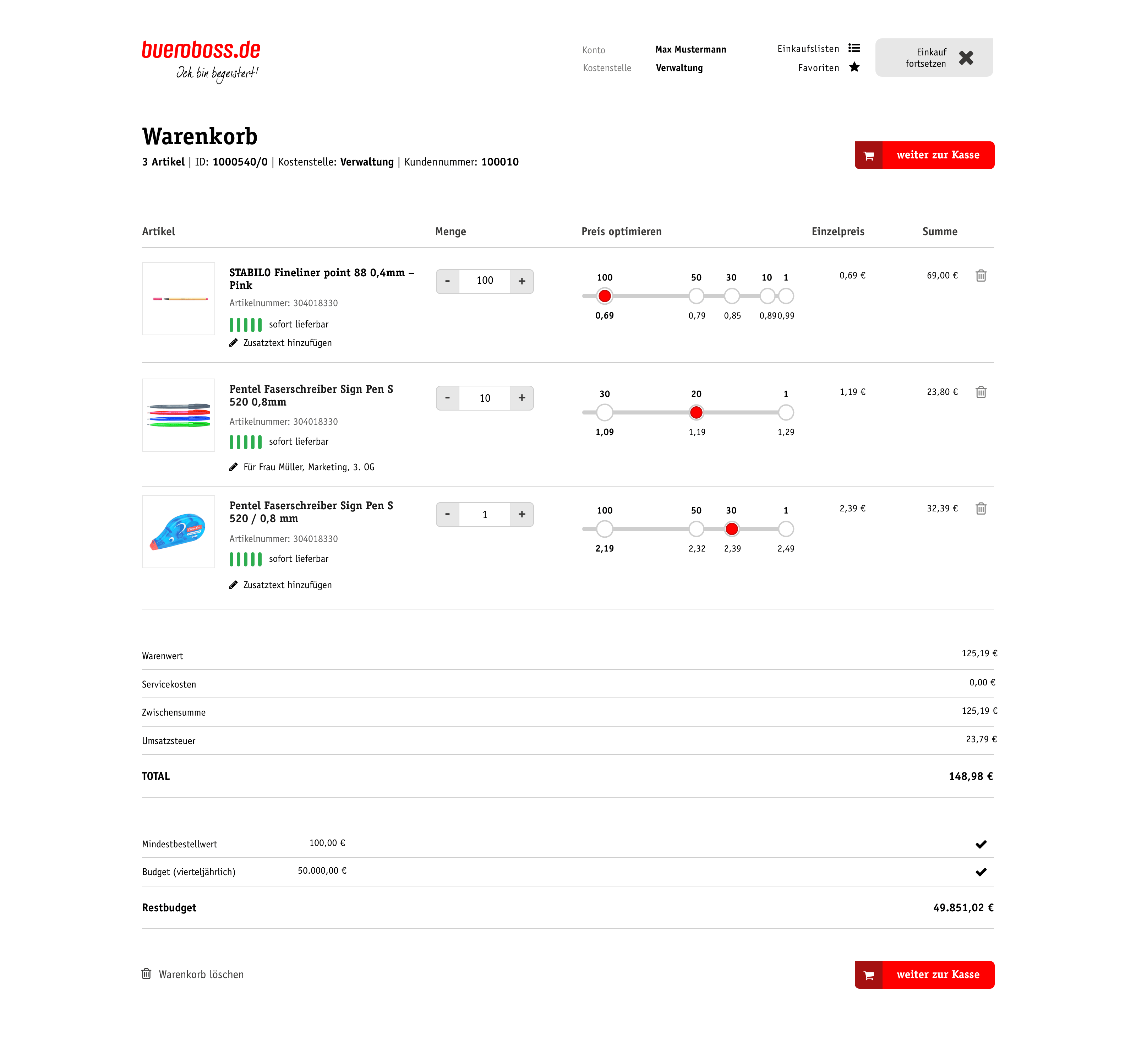
Office supplies are often sold with block pricing – the more items you buy, the cheaper the single item gets.
These price ranges are usually displayed as a plain text table. Customers have to read this list and choose the amount of items by typing it into a field without any feedback, let alone affordance.

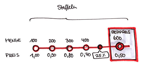
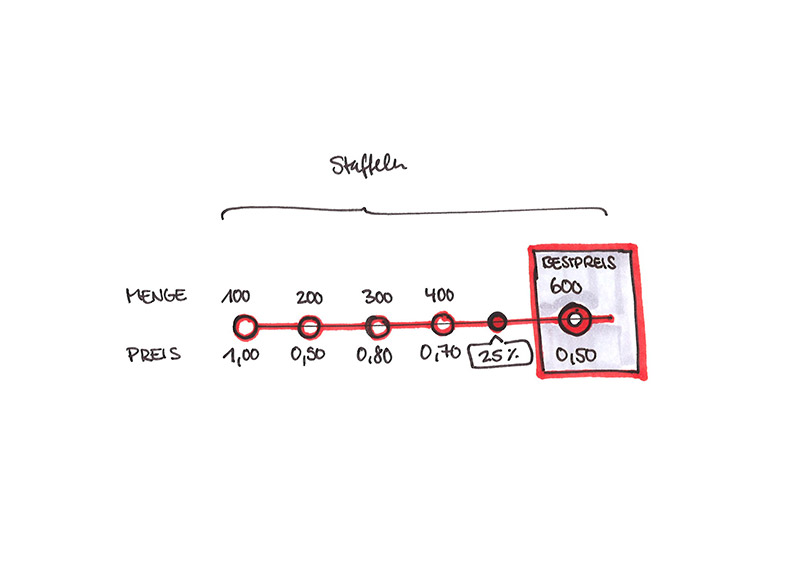
I saw a huge opportunity to improve the user experience around buying articles with block pricing and pitched and invented the concept of a "block pricing slider". It is serving multiple functions:
- choosing the amount of items
- displaying block prices visually
- calculating the total price instantly
- encouraging customers to buy in bulk to save costs through making price ranges visible and interactive

The concept was appreciated and made it into the online shop, leading to great results with bueroboss' customers.
Takeaways Learnings & Conclusion
It was a pleasure to work at this complex project. I especially enjoyed the preparedness of bueroboss as a client and the collaborative concept development approach with its extensive pen and paper phase. In particular for this project with its many constraints, requirements and stakeholders it was very instrumental.
Results
Besides the obvious visual and technical improvements, a survey proofed that the user experience after the redesign was very well received by customers and local partner branches.
Six months after the relaunch, customers were asked to make a before-and-after comparison - with the following result:
- 75% confirm an improvement in the overall user experience compared to the old system
- 65% report an improvement in the time required to complete their tasks
- 63% report an improvement in searching & finding items
- 65% recognize an improvement in the information content of products
The redesign gave bueroboss.de and edge and led to economic advancement in a highly competive business environment.